

The Lodge Space Rebrand
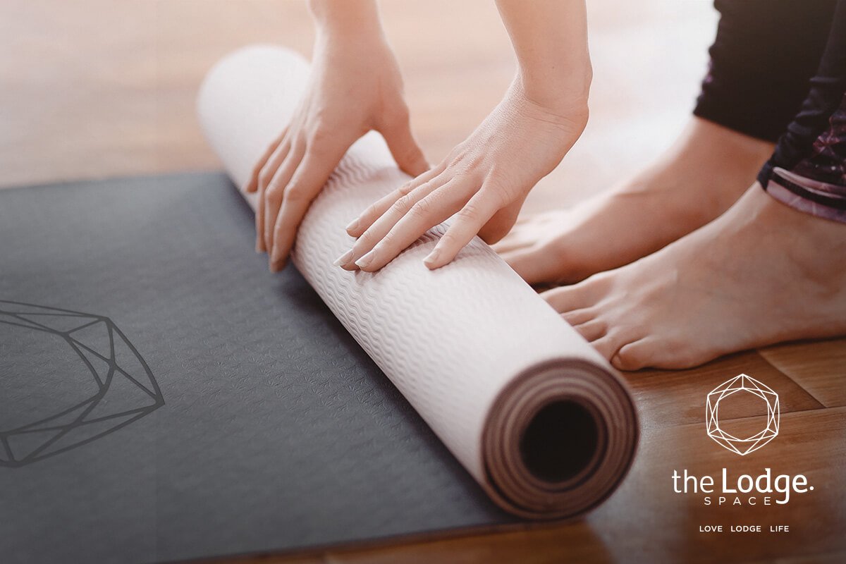
The Lodge is a multipurpose fitness, wellness and dining space. The Lodge required an identity rebrand and visual creative direction to encapsulate their ethos and continued expansion. A new logo, brand mark, visual identity and assets were created based on their target market and core fundamentals.
Creative direction/development of brand & identity.
Brand Identity
Creation of brand colour palettes, typography & identity.
Logo Artwork
Logo concepts, creation & artwork development.
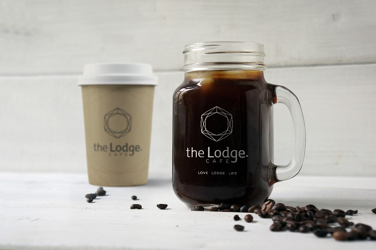
Promotion Collateral
Creation of digital and print collateral to promote The Lodge.
Brand & Logo Development
The arrangement of The Lodge branding and visual marks have been carefully considered to create a visual balance of sacred geometry and organic shapes that draw from alchemical symbols.
Artwork Refinement
A number of artwork and logo mark concepts were created drawing from sacred geometry and the ethos of The Lodge. These concepts were presented and worked through with the client to narrow down the icon mark concept. From this concept the logo was further refined and tested through various stages until the final icon and word mark were agreed upon.
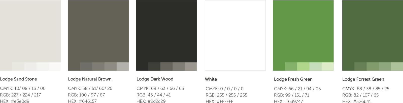
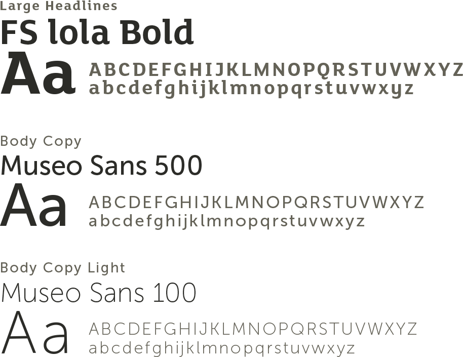
Colour Palette & Typography
The palette for The Lodge has been carefully balanced to create tones that deliver both soft neutral, earthy foundations as well as strong deep contrasting tones. These colours were chosen not only to compliment the interior decor of The Lodge, but to represent the healthy, vegan friendly foundation of the space.
The typefaces used as part of The Lodge’s visually identity were intentionally selected to cultivate an organic and clean feel to the brand. The mix of complementing serifs and sans serif typefaces creates a friendly and well considered reading experience for users, while enabling the brand to set itself a unique and professional presence.